

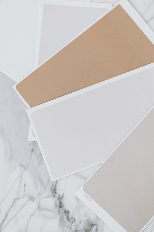
Choosing the right colors for your home can have a big impact on the mood and atmosphere inside. Calm colors are especially popular because they help create a peaceful and relaxing environment. Whether you’re painting a bedroom, living room, or any other space, selecting colors that soothe the mind can make your home a true retreat.
In this article, we’ll explore how to pick calm colors effectively and provide tips to help you design a tranquil space that feels welcoming and comfortable.
Why Choose Calm Colors?
Calm colors are often associated with serenity, balance, and restfulness. Unlike bright or bold hues, they don’t overwhelm the senses but instead help reduce stress and promote relaxation. Using calm colors in your home can encourage better sleep, enhance focus, and make everyday living more enjoyable.
Typical calm color palettes include soft blues, gentle greens, muted neutrals, and pastel shades. These tones tend to work well in almost any room.
Understand Color Psychology
Before picking specific hues, it helps to understand the emotional effects of different colors. Here are some common calm colors and what they generally convey:
– Blue: Often linked to tranquility and calmness, blue can lower heart rates and create a soothing atmosphere. Light blues are excellent for bedrooms and bathrooms.
– Green: This color symbolizes nature and renewal. It’s restful for the eyes and promotes relaxation, making it ideal for living rooms and reading nooks.
– Beige and Soft Neutrals: These colors provide a warm, cozy feeling without being distracting. They create a perfect backdrop for furniture and decor.
– Lavender and Soft Purples: Gentle purple tones can add a subtle sense of luxury and calm without being overpowering.
– Pale Pink: Muted pinks bring warmth and softness to a space, often creating a comforting environment.
Tips for Choosing Calm Colors for Your Home
1. Consider the Room’s Purpose
Think about how you will use the room. Bedrooms and bathrooms benefit from colors that promote quiet and rest, like pale blue or soft green. Living rooms and dining areas might allow a bit more warmth, such as soft beige or muted lavender. For workspaces, choose calm but stimulating colors like gentle greens or grays to help with focus.
2. Test Samples on Your Walls
Paint colors can look very different depending on lighting and room size. Always test samples directly on your walls before making a final decision. Observe the samples throughout the day to see how natural and artificial light affect the color’s appearance.
3. Use a Neutral Base with Color Accents
If you’re unsure about using too much color, start with a neutral palette—such as light beige, cream, or pale gray—on walls. Then, add calm color accents through furniture, cushions, curtains, or artwork. This approach allows flexibility and easy updates.
4. Balance Warm and Cool Tones
Calm colors don’t have to be all cool shades like blue or green. Warm neutrals like taupe or soft peach can also create a peaceful feeling. Balancing warm and cool tones adds depth and avoids a space feeling too cold or clinical.
5. Keep the Color Palette Simple
Too many colors can create visual clutter, which may be counterproductive for achieving calmness. Stick to two or three complementary colors in the room. This simplicity helps create harmony and a cohesive look.
6. Think About Texture and Finish
Color is important, but texture plays a big role in how calming a room feels. Matte or eggshell finishes are generally softer and less reflective than glossy paints, adding to the relaxing vibe. Incorporate soft textiles like cotton, linen, or wool to complement the color scheme.
7. Use White and Off-White Wisely
White and off-white shades can brighten a room and create a sense of openness, which is calming for many people. However, pure white can sometimes feel stark. Creamy or warm whites are better choices for a softer, more inviting atmosphere.
8. Avoid Colors That Are Too Dark or Intense
While deep blues or greens can be calming, very dark colors may make a room feel smaller or gloomy. Similarly, overly bright pastels might lose their soothing quality. Aim for medium to light shades for best results.
Example Calm Color Palettes for Different Rooms
Bedroom Palette
– Soft Sky Blue
– Warm Beige
– Crisp White
Living Room Palette
– Sage Green
– Light Taupe
– Cream
Bathroom Palette
– Pale Aqua
– Soft Gray
– White
Home Office Palette
– Dusty Green
– Light Charcoal
– Soft White
Final Thoughts
Choosing calm colors for your home is a wonderful way to create a peaceful retreat that supports relaxation and well-being. Take your time exploring different shades, test samples, and consider the room’s purpose. Remember that color is just one piece of the puzzle—lighting, furniture, and accessories also contribute to the overall mood.
With these tips, you’ll be well on your way to selecting calm colors that make your home feel like a haven every day. Happy decorating!